The observations quickly turned into jokes about how the name is pronounced
What Adam Mosseri said about the criticism of the change
Mosseri seemed to anticipate user reactions by sharing the announcement on Threads as well. There, he invited people to share their different opinions about the new design.
Social media consultant Matt Navarra also commented on the change. He felt that design specialists would have a lot to analyze, although he personally described the new logo as fresh, modern, and true to the original.
Navarra also mentioned the interpretation of those who believe the design looks like it says "Instagzam", although he noted that this reading did not bother him.
Criticism of Instagram for other issues with the platform
The complaint pointed to the lack of responses and an effective mechanism to recover those accounts. The account requested that Instagram also prioritize individuals and businesses that depend on their profiles.
The Instagram icon will not change
Despite the renewal of the Instagram logo, the traditional multicolored icon of the platform will remain the same.
The change focuses on the wordmark, which has been updated for the first time in 10 years. The company aims to maintain the original identity while incorporating a more current aesthetic.
Instagram presented an update to its logo this Thursday, the first design change in 10 years. The renewal aims for a “cleaner and more modern” identity, as explained by Adam Mosseri, the head of the platform.
However, the change was met with mixed reactions on social media. Some users questioned the legibility of the new design and pointed out that certain letters could be confused with others.
Instagram unveiled an update to its logo this Thursday
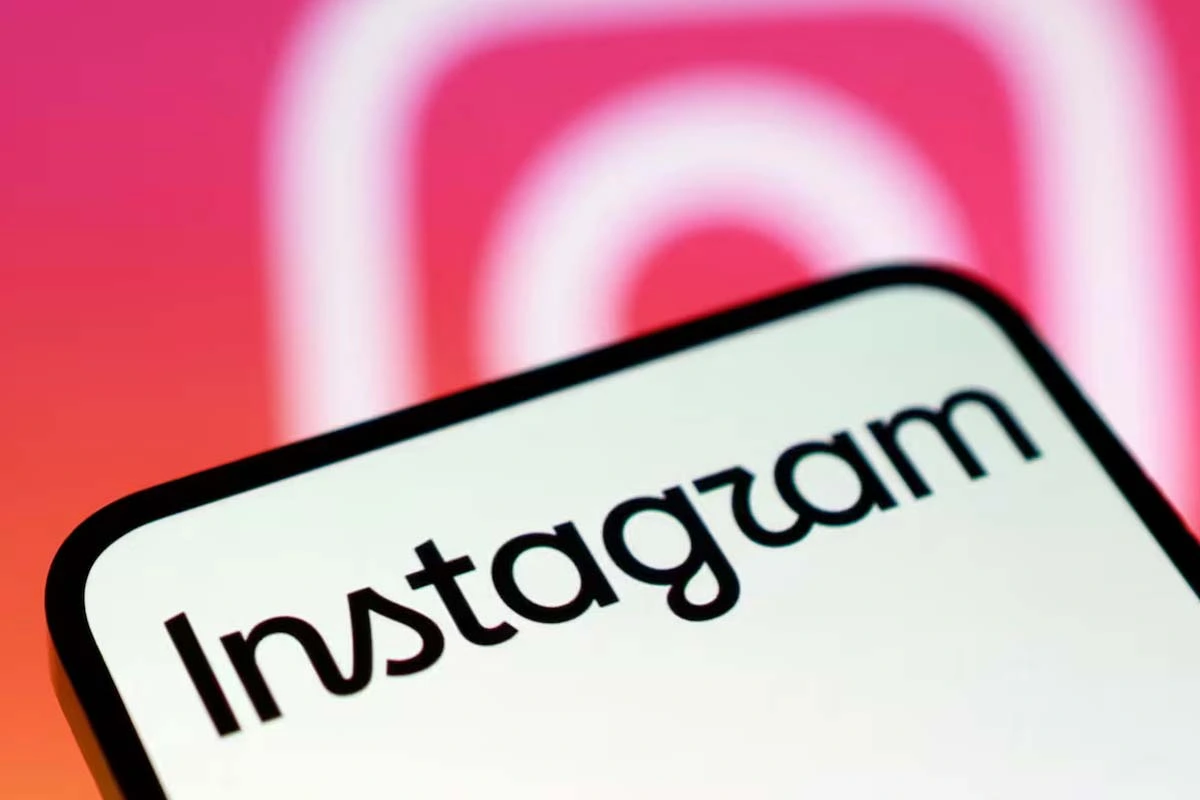
What the new Instagram logo looks like
Adam Mosseri explained that the Instagram wordmark had not changed in a decade and that it was time to update it. The proposal seeks to retain references to the original design, but with a more modern aesthetic.
The new logo maintains the visual identity of the platform, although it modifies the typography used to write Instagram. The traditional multicolored camera-shaped icon, on the other hand, was not altered.
Why users mocked the new Instagram logo
One of the main criticisms was related to the shape of some letters. Several users pointed out that the stylized “r” can look like a “z” or a “u,” while the “s” was compared to an “a.”
Why users mocked Instagram's new logo
The comments quickly turned into jokes about how the platform's name reads. One user wrote that the logo looked like it said "Instagzam", while another compared it to how a child might pronounce "Instagwam".
There were also more serious criticisms related to accessibility and legibility. One user questioned whether the new design would pass accessibility checks and claimed they could barely read it.